Finding a design language
How this site found its look.
Until September this site was cream paper, a serif headline and cards with a green stripe down their left edge. Then I decided to redesign it from scratch.
This post is about how I got from that to what you are looking at: what I like, what I tried and threw away, and where Atlas came from. The companion post, How this site works, goes through the code.
Where it started
The brief I gave myself was "minimal, clean, premium". That narrows nothing down on its own. Plenty of sites are all three and look nothing alike, so I had to work out what I actually meant.
The answer was older than the brief. I love Teenage Engineering. Their instruments are grey aluminium with small orange marks, numbered controls and little readout screens, and their manuals read like spec sheets. Nothing on them is there for decoration. Each mark tells you what something does or what state it is in.
I am a software engineer with a knack for design, and that kind of design suits an engineer. It comes out of what the thing does, so you can justify every line.
Looking around
I started with an archive of real, shipped sites and looked for patterns rather than favourites. Most portfolios there set the headline in a grotesk sans, sit on a mid-tone ground and use one warm accent. That was useful as a baseline, but looking at other people's sites only gets you so far. In the end I had to come up with something of my own.
I also went through a gallery of a hundred single-file HTML demos for techniques: 12-column hairline guides, tabular figures so numbers line up, themes done as a swap of colour tokens, SVG lines that draw themselves. I noted what I would never use as well: neon, glitch effects, claymorphism, and heavy canvas simulations. That last one is funny now, because the background of this site is a canvas simulation.
Five directions
Then I drew five complete directions, each as a desktop page and a phone page with real content, so I could compare whole pages rather than swatches. They ranged from a serif on warm paper, to a Swiss grid, to my name in huge type over a photo, to a straight Teenage Engineering homage in aluminium grey and signal orange.
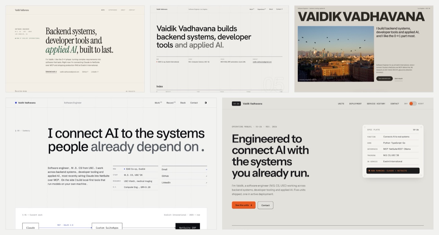
I picked the systems index, bottom left: a grotesk on cool paper, one ultramarine accent, and every project drawn as a chain of parts. The Teenage Engineering one was a very close second. I love it, but the other was a tad better.
More useful than the pick was what all five had in common, because those choices survived everything after: one accent colour, numbers in mono, structure from hairlines instead of cards, dark mode as a swap of tokens, and a phone layout composed for the phone instead of a squashed desktop.
What I actually built
The pick never shipped as drawn. Its 12-column grid needed a wide screen, and most of what I had to say reads better in a narrow column, so when I sat down to build I went narrow and kept its type, colour and rules. From there each version replaced the last idea: a golden-section drawing that zoomed into itself, a first Atlas holding a celestial sphere, a Chladni plate in his place, and then the whole site as one instrument.
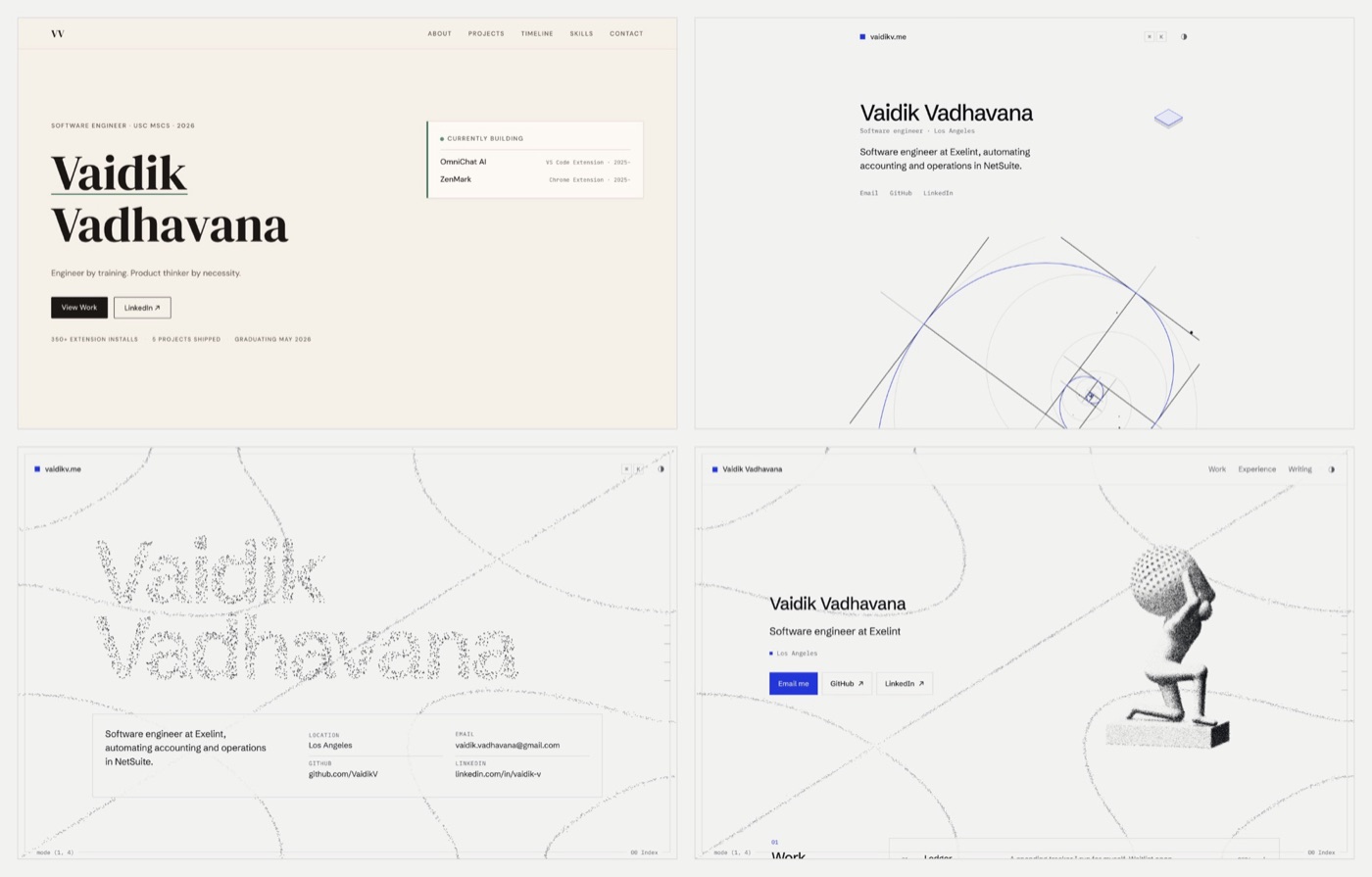
The turn was the Chladni plate. Sand on a vibrating plate settles on the lines that stay still, and each note makes a new pattern. Once that sat behind the page, the page started to behave like an instrument: each section plays a note, there is a hairline frame around the window, a scale down its edge, and readouts in the corners that tell you which mode the plate is in.
Those readouts are the Teenage Engineering mockup's readout displays, back in a quieter form. Its grey and orange didn't make it, but the idea of the page as an instrument did.
Atlas
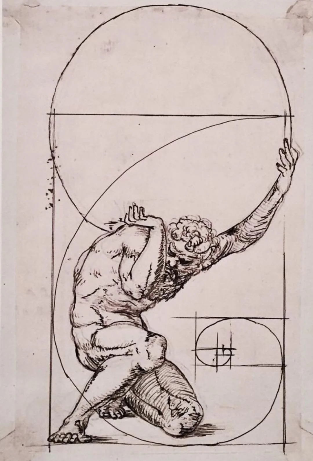
Atlas is here because of one drawing. It is a pen sketch of him kneeling, one hand pushed up against an enormous sphere, and the whole figure is laid over the construction lines of the golden ratio: a golden rectangle, the squares nested inside it, and the spiral running through them. I like it a lot, and it is the reason he is here.
I did not trace it. The Atlas on the home page has his own pose: kneeling on a plinth, the sphere on his back, both hands up to hold it, the back foot on its toes as if he is pushing up under the weight. He is built from about fifteen simple shapes in code. The sphere he holds carries 377 points, each turned by the golden angle from the last.
He went through a few versions. The first was a smooth 3D figure, and for a while the plate replaced him. When the sand became single pixels I brought him back drawn in grain, so he is made of the same material as the background. After that came small corrections: the far elbow tucked behind his head, a waist, the head a little lower.
The language now
Written down, the whole design language fits in a short list. Everything on the site follows it:
- One ultramarine accent. It marks what you can act on and where you are, and nothing else.
- Schibsted Grotesk for words, IBM Plex Mono for numbers and labels, with tabular figures.
- Hairlines, square corners, no shadows. Structure comes from lines and space.
- The page is an instrument: sand on a plate, a frame, a scale and readouts.
- Phones first. Every change is checked at 320px wide before a laptop.
How the sand moves and how Atlas is drawn in grain is in the companion post, How this site works.